The redesign of the Athens Metro Map was developed as a personal project in response to the upcoming Line 4, a major expansion of the city’s transit network. The project explores how clarity, consistency, and accessibility can enhance the daily navigation experience of residents and visitors alike. The new map visualises the first phase of Line 4 — the yellow line — connecting central Athens with key neighbourhoods such as Kipseli and Kesariani. Beyond integrating the new line, the project rethinks the map’s visual system, addressing challenges such as the coexistence of two alphabets (Greek and Latin) and the fragmented identity of Athenian transport services, each with its own set of logos and design languages. By establishing a unified, intuitive graphic language, this redesign seeks to create a map that feels coherent, contemporary, and effortless to read — a tool that simplifies movement through the city and strengthens the visual identity of Athens’ public transport.
Current Limitations
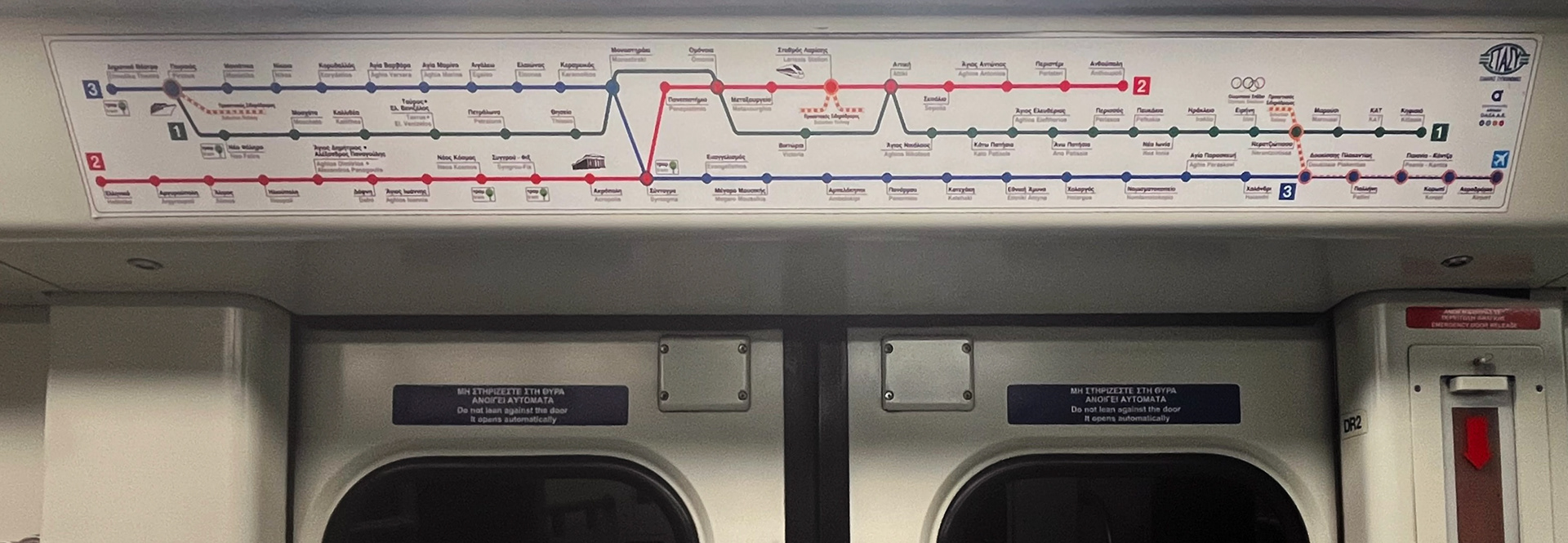
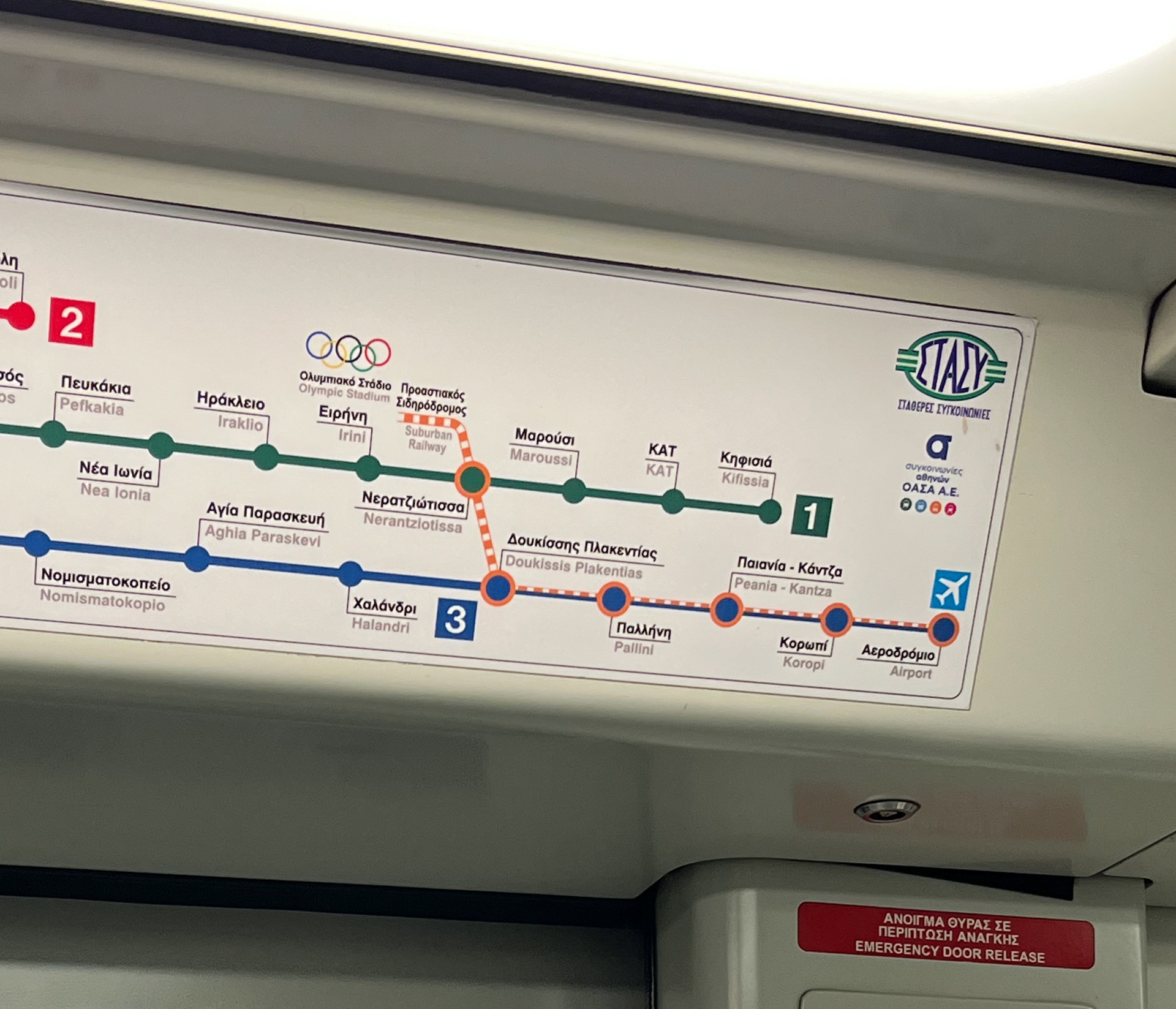
Firstly, the current metro map (image 1) is outdated. It is essentially the original design from 2004, with later station additions incorporated in a way that lacks visual coherence. Despite the network’s expansion, this same map is displayed in every train wagon across all lines. Its rigid, rectangular layout makes it nearly impossible to integrate the upcoming Line 4 in a clear and consistent manner.
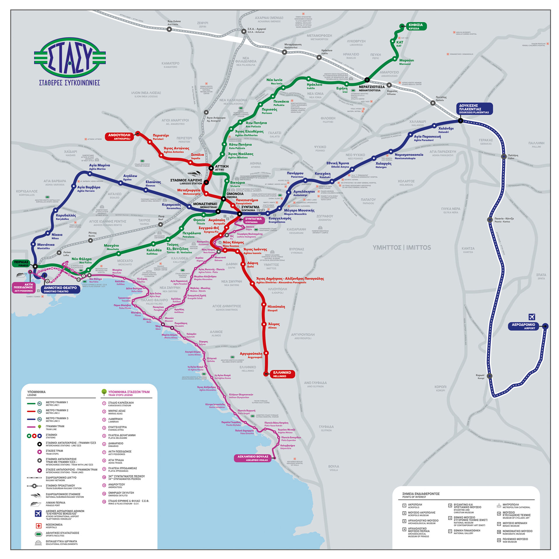
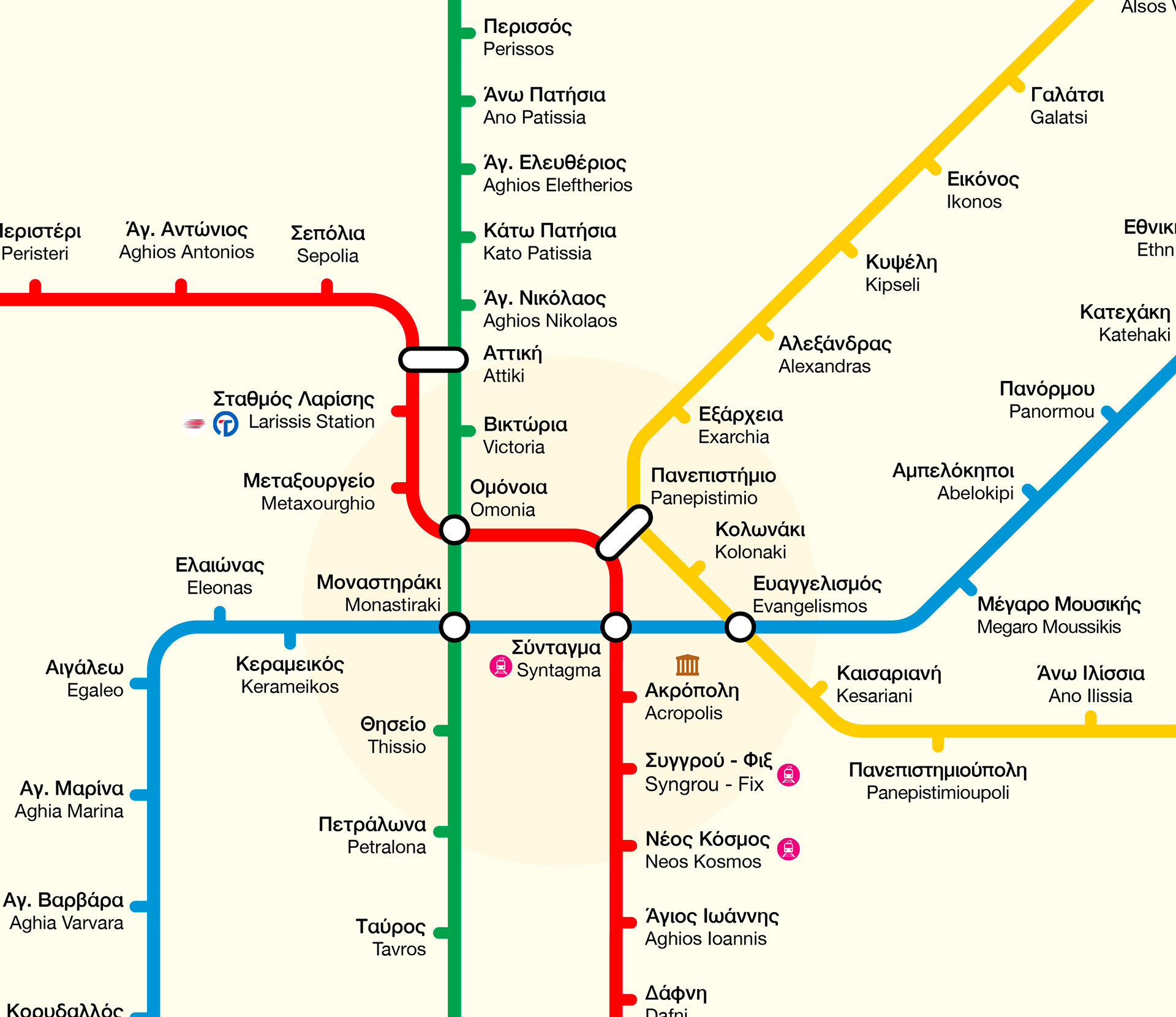
Secondly, the geographical map of Athens Transport (image 2) found on the platforms is informative as a geographical reference, but not intuitive for quick navigation. Some stations even appear only in the legend due to space limitations, as the design prioritizes geographic accuracy over the passenger experience.
Thirdly, the coexistence of Greek and Latin alphabets further constrains space and reduces legibility (image 3). Station names often become cramped or abbreviated, making them harder to read at a glance. This not only slows down navigation but also increases cognitive load, particularly for visitors or passengers unfamiliar with the network, creating a less intuitive and more stressful transit experience.
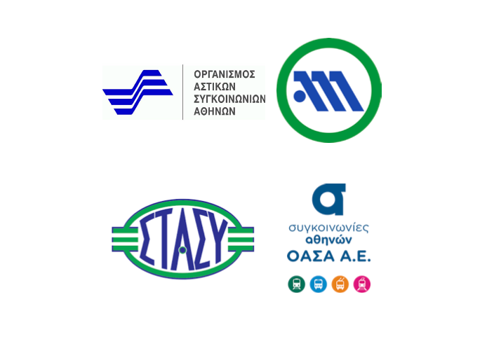
Furthermore, my research revealed that the Athens Transport company currently uses over four different logos for the same purpose (image 4). In 2018, an effort was made to unify the visual identity under “Συγκοινωνίες Αθηνών – ΟΑΣΑ,” yet inconsistent application persists. Passengers still encounter outdated versions in new publications, leading to visual confusion and a fragmented brand identity. Similarly, the same issue extends to the Athens Tram, the Hellenic Railway, and the Suburban Railway systems, all of which a metro user encounters. Multiple outdated logos coexist without coherence, making navigation more difficult for passengers within a system that relies heavily on visual symbols and consistent information design.
Redesign Proposal
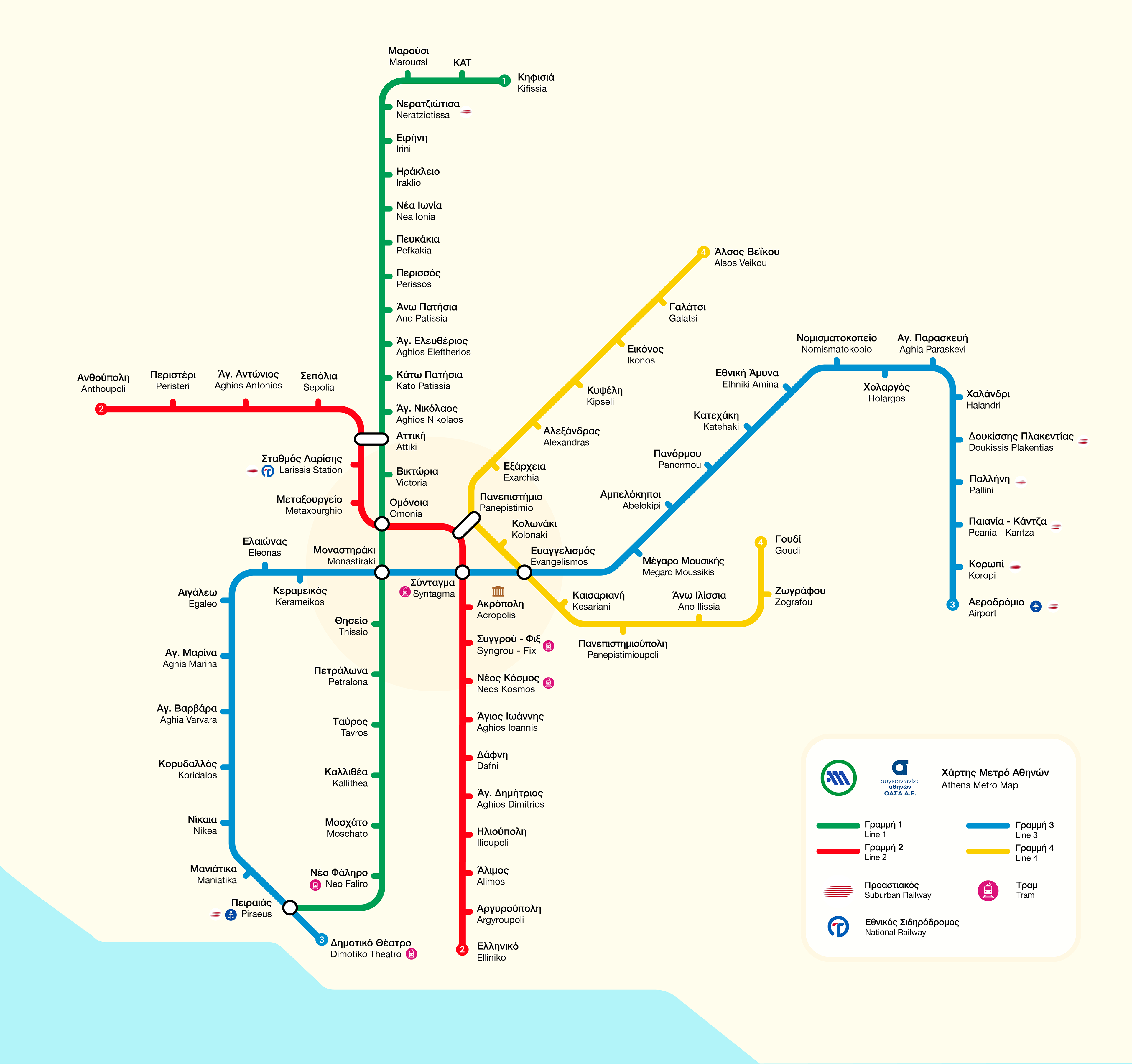
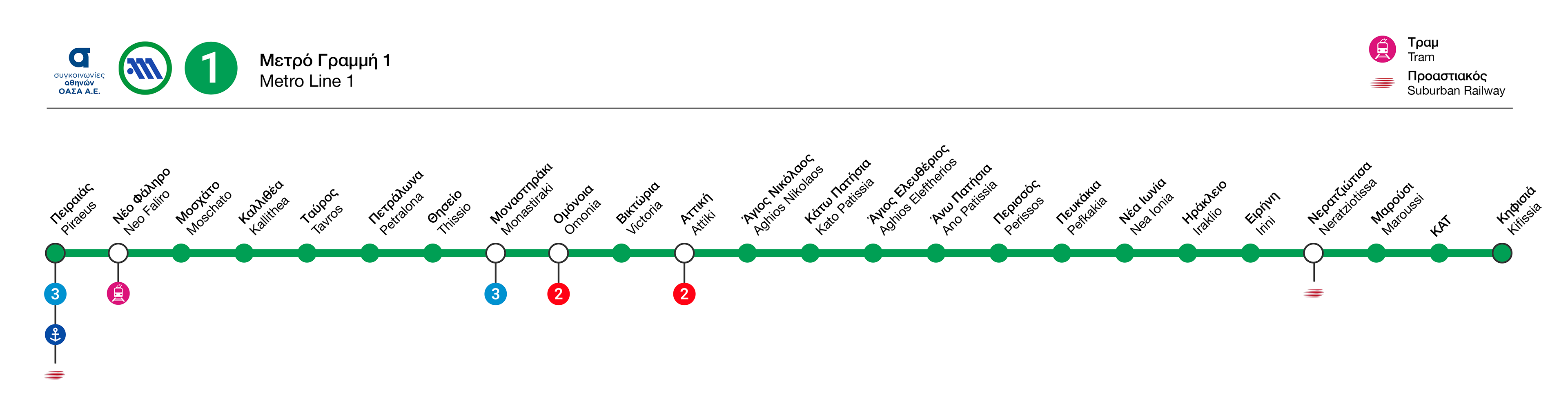
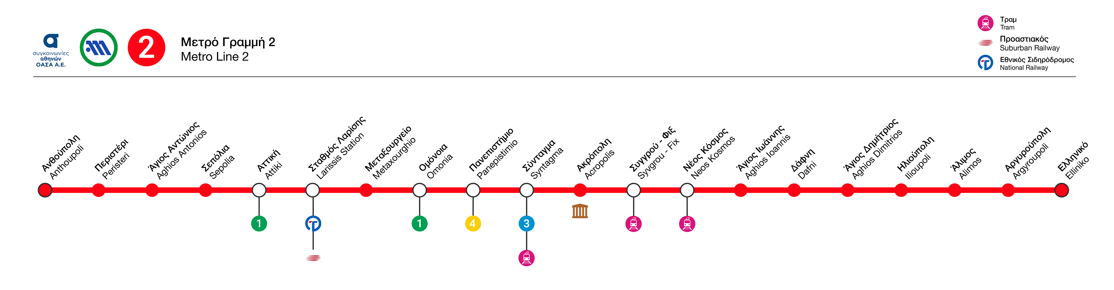
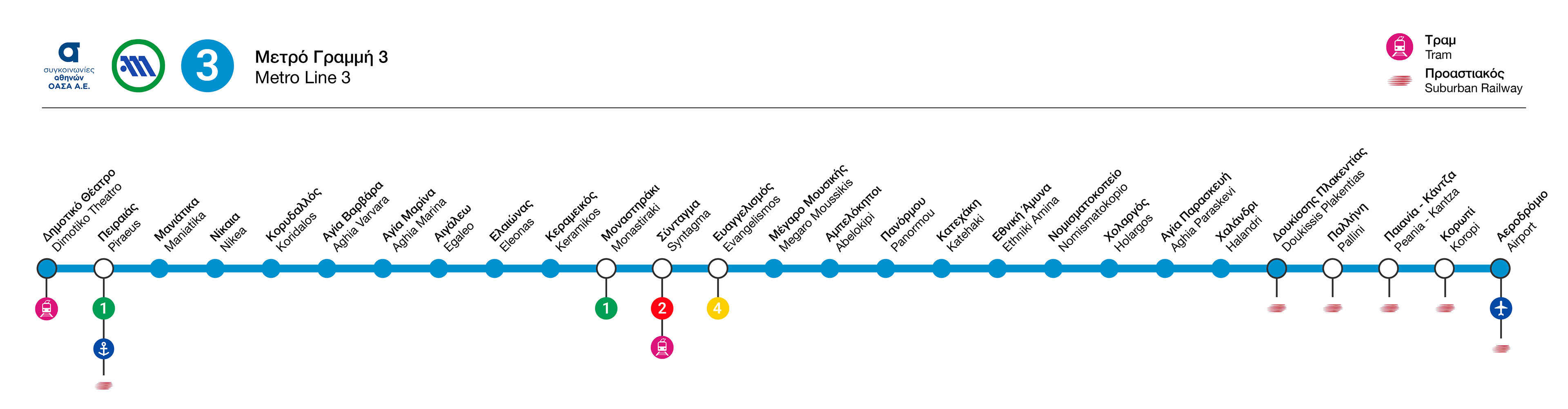
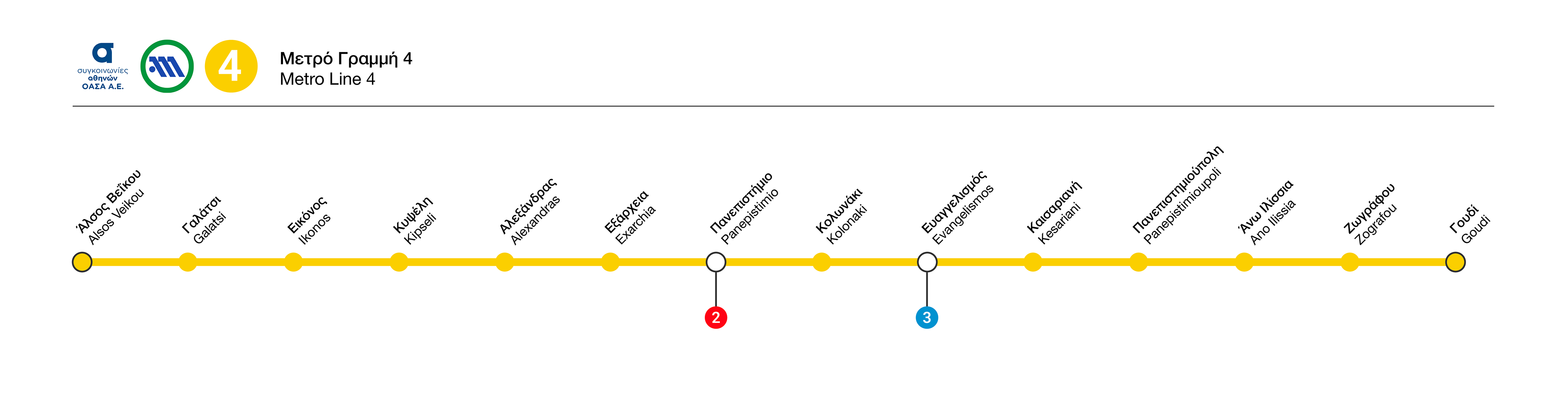
To address the issue of the outdated metro map, a new comprehensive map was created, presenting a simplified view of the city and its coastline, along with the four metro lines that traverse it. In addition to the main map, four distinct maps were designed — one for each metro line — using clear and minimal iconography to highlight changes, transfer points, and airport or port connections. This redesign also functions as a solution to the existing geographical map, combining clarity with geographic awareness.
The first phase of Line 4, “Alsos Veikou – Goudi,” has been included, while future extensions have been considered and can be easily incorporated without disrupting the simplicity of the design.
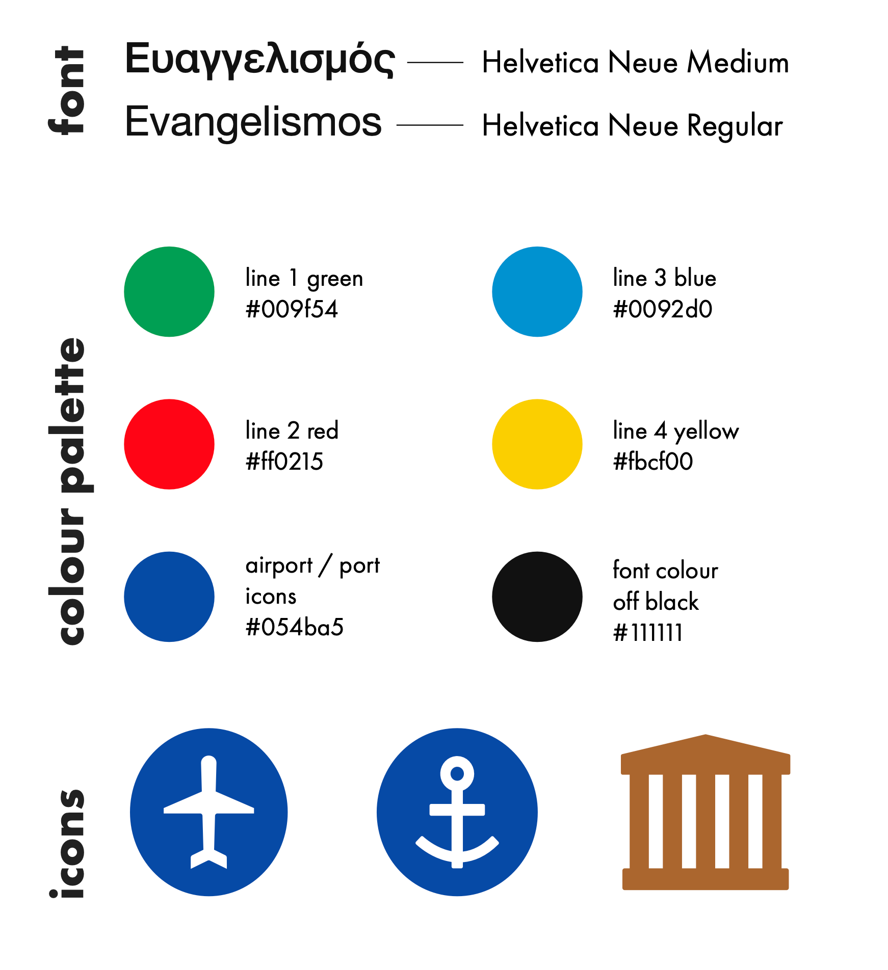
To address the challenges of using both Greek and Latin alphabets, Helvetica Neue was selected as the typeface for the redesign for three main reasons. First, it offers excellent legibility in both print and digital formats, across Greek and Latin characters. Second, it scales successfully, maintaining clarity at sizes ranging from small captions to large display text. Third, Helvetica is already used in Athenian metro signage, allowing for cost-effective implementation while ensuring visual coherence across the system.

Regarding the iconography, the latest Athens Transport rebranding included icons for the tram line, which were adopted in this proposal to reinforce coherence with the overall branding. The Suburban Railway icon was also used alongside the Hellenic Railway’s, based on on-site research showing that both logos are actively used, depending on the railway line.
Drawing inspiration from the successful systems of the London Underground and the Paris Metro, this proposal integrates the design language of the unified Athens Transport branding, with the passenger experience at its core. Clarity, coherence, and accessibility are the guiding principles behind the redesign.
Through this process, I reinforced my belief that design must balance clarity, functionality, and aesthetic harmony, creating solutions that are both visually compelling and genuinely user-centered.