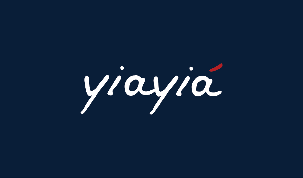
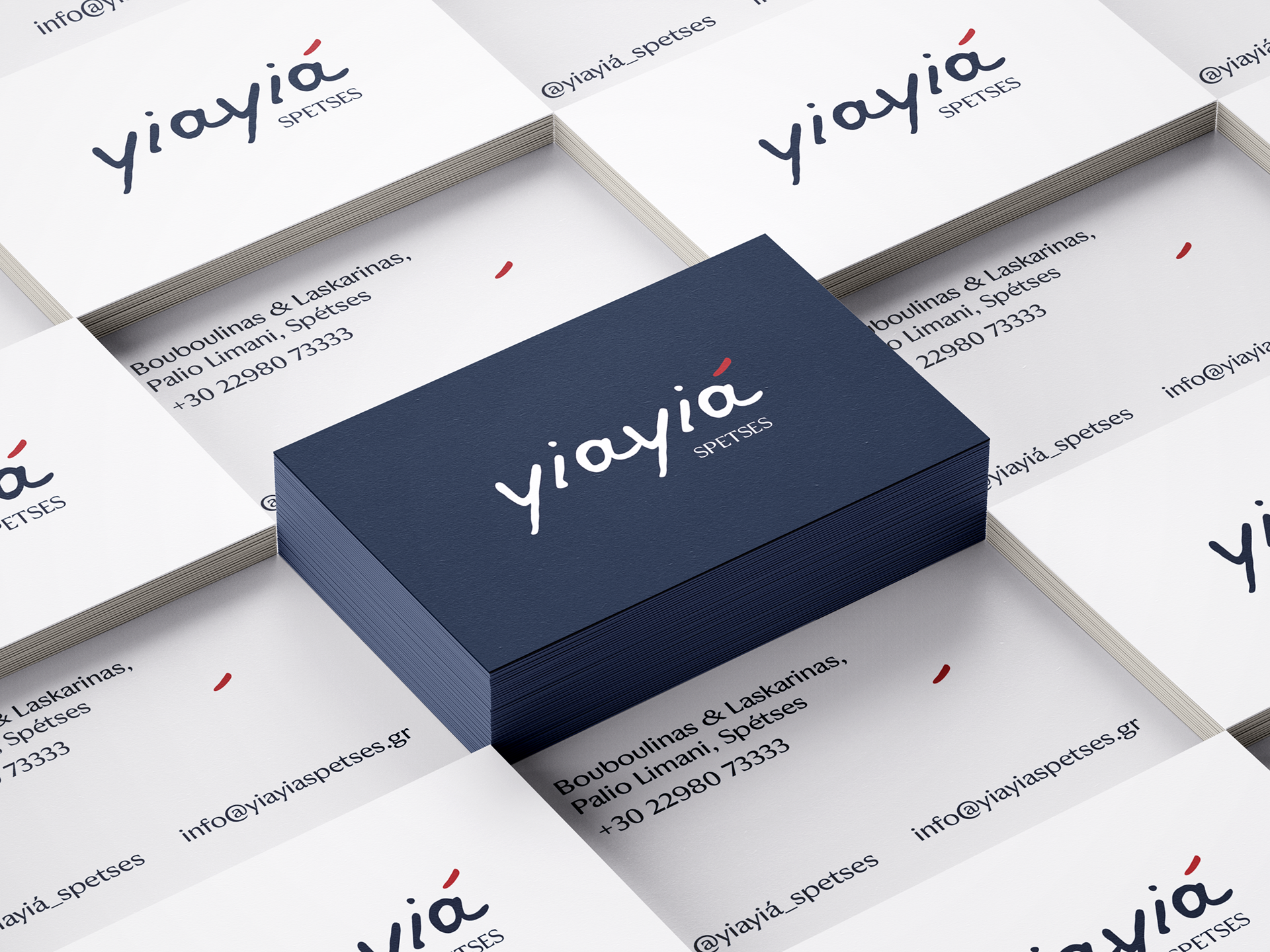
I was commissioned to design the logotype for a new restaurant on the island of Spetses, called yiayiá. The owners wanted a visual identity that captured the island’s atmosphere—a blend of Greek and French gastronomy. While the name yiayiá means “grandmother” in Greek and evokes tradition, the brief called for a fresh and unconventional approach to create a striking contrast.
My inspiration came from the waves of the Aegean Sea. The hand-written logo I designed echoes the soft, fluid lines left behind by small boats drifting through the summer waters—an abstract nod to movement, memory, and Mediterranean elegance.
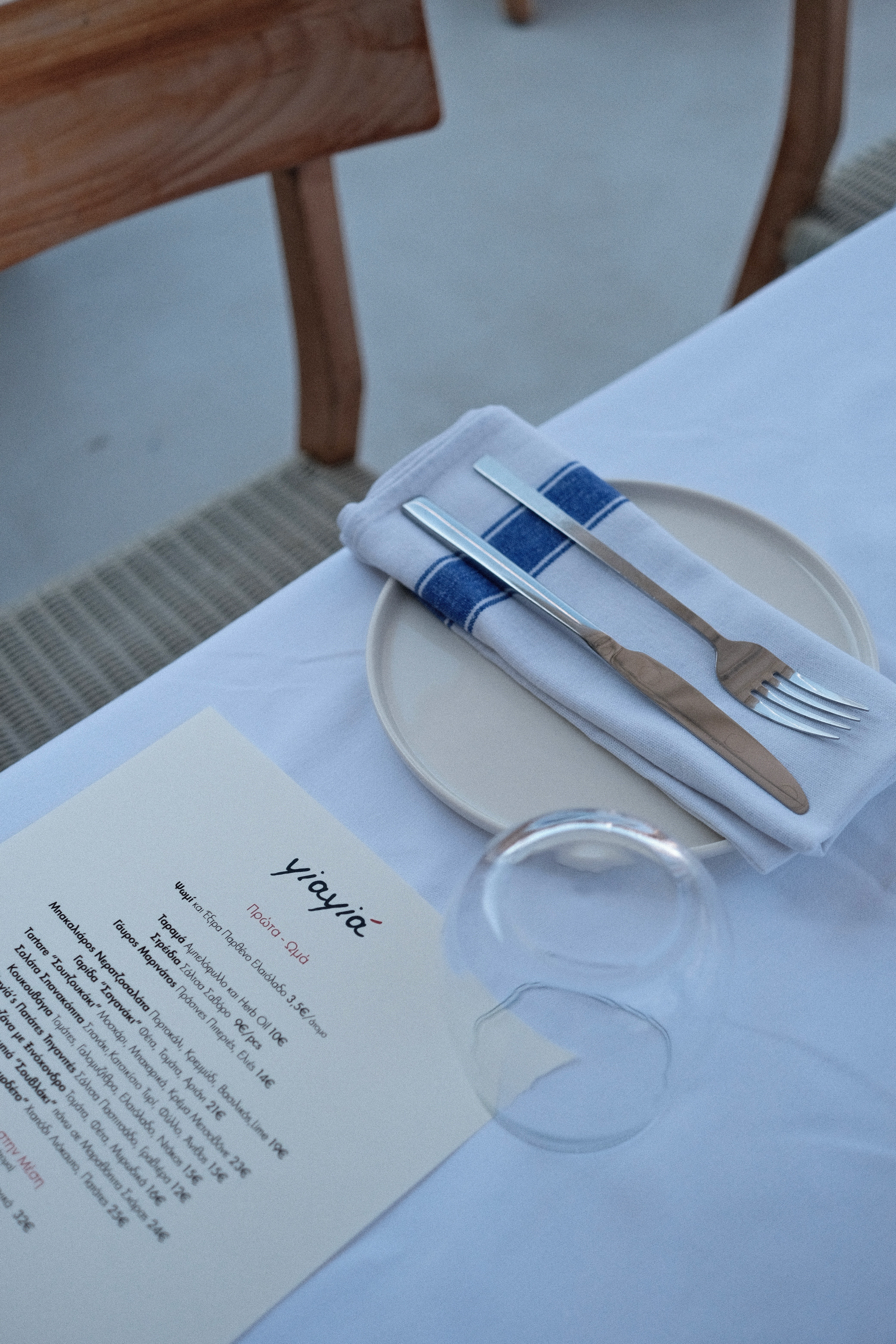
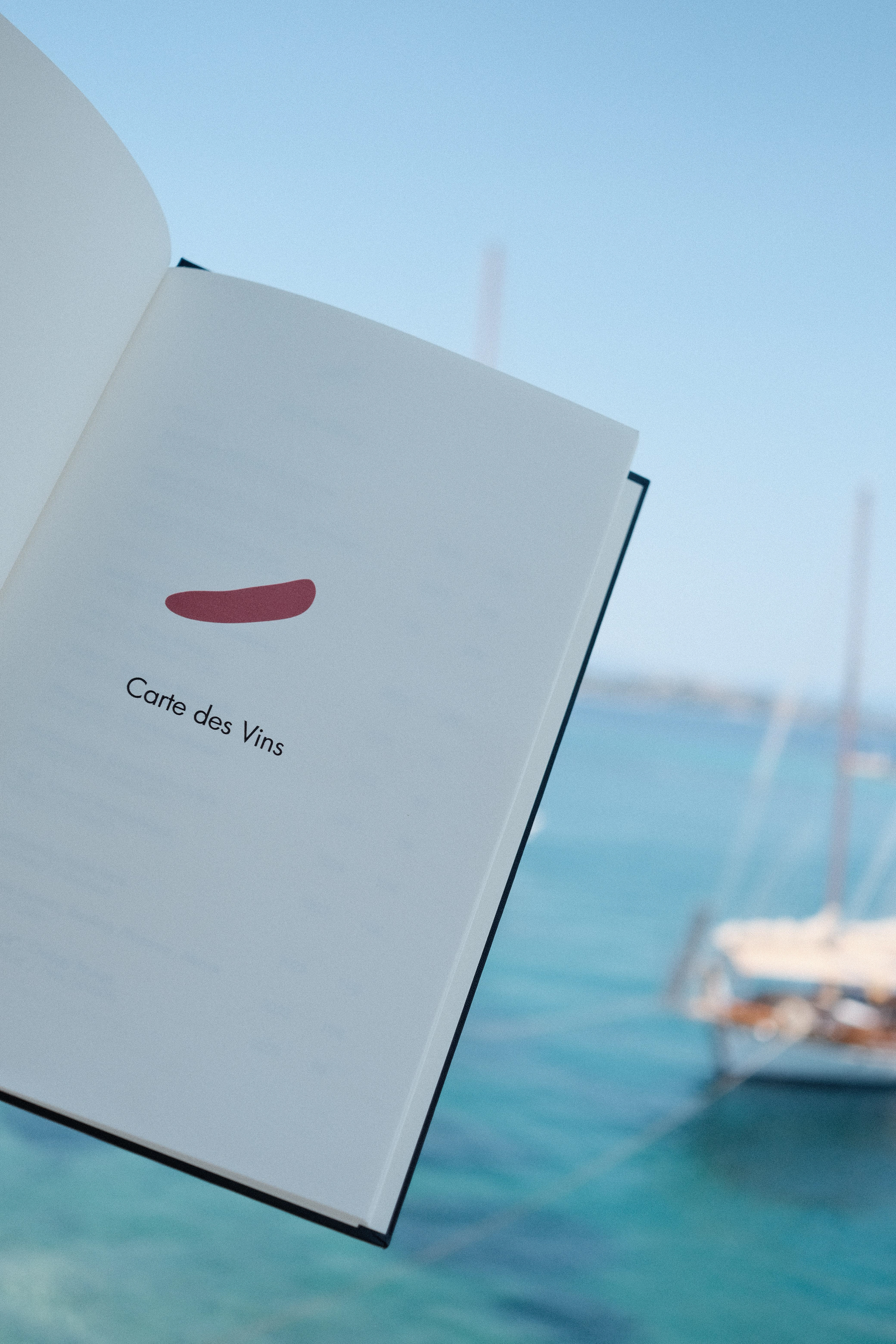
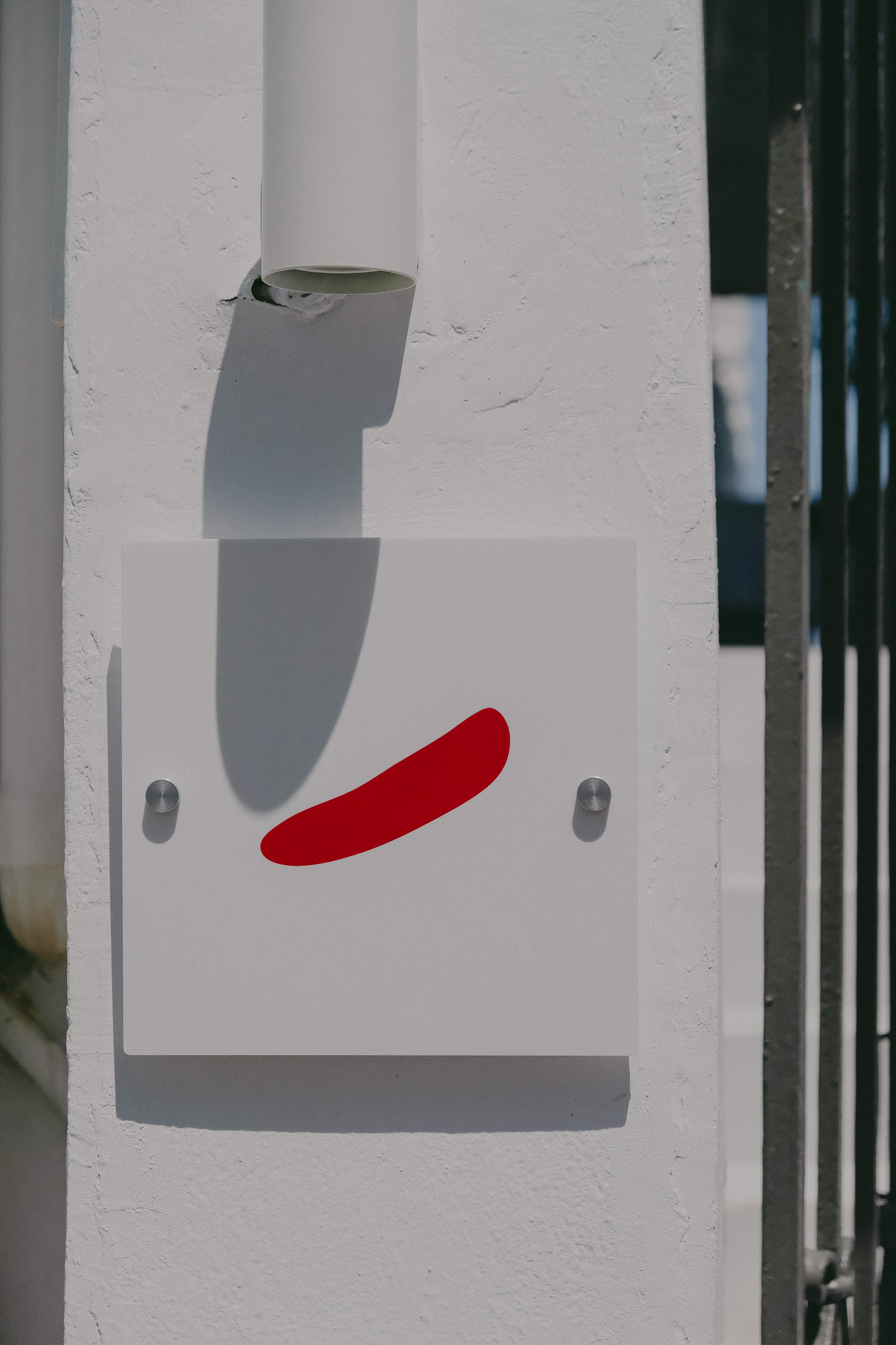
I designed the logo, business cards, and menu template, developing a minimal, type-based identity. The logo was drawn by hand from scratch, giving the wordmark a distinctive, personal rhythm that reflects the restaurant’s warmth and authenticity. The use of the accent aigu (á) became a key detail — both a typographic feature and a subtle visual link to the chef’s wider family of restaurants. The colour palette of navy, red, and white was inspired by the French tricolore, symbolising the restaurant’s gastronomic roots and its connection to French culinary culture. A red accent mark at the restaurant entrance reinforces the brand in a simple yet memorable way, serving as a visual signature.
Through a hand-crafted logo, thoughtful typography, and a palette rooted in French heritage, yayá captures the effortless sophistication of a French-Greek seaside experience
— elegant, inviting, and timeless.